My PISA twitter bot
I’ve long wanted to prepare a project with R related to education. I knew I’d found the idea when I read Thomas Lumley’s attempt to create a Twitter bot in which he tweeted bus arrivals in New Zealand. Quoting him, “Is it really hard to write a bot? No. Even I can do it. And I’m old.”
So I said to myself, alright, you have to create a Twitter bot but it has to be related to education. It’s an easy project which shouldn’t take a lot of your time. I then came up with this idea: what if you could randomly sample questions from the PISA databases and create a sort of random facts generator. The result would be one graph a day, showing a question for some random sample of countries. I figured, why not prepare a post (both for me to remember how I did it but also so others can contribute to the project) where I explained step-by-step how I did it?
The repository for the project is here, so feel free to drop any comments or improvements. The idea is to load the PISA 2015 data, randomly pick a question that doesn’t have a lot of labels (because then it’s very difficult to plot it nicely), and based on the type of question create an appropriate graph. Of course, all of this needs to be done on the fly, without human assistance. You can follow this twitter account at @DailyPISA_Facts. Let’s start!
Data wrangling
First we load some of the packages we’ll use and read the PISA 2015 student data.
library(tidyverse)
library(forcats)
library(haven)
library(intsvy) # For correct estimation of PISA estimates
library(countrycode) # For countrycodes
library(cimentadaj) # devtools::install_github("cimentadaj/cimentadaj")
library(lazyeval)
library(ggthemes) # devtools::install_github("jrnold/ggthemes")
file_name <- file.path(tempdir(), "pisa.zip")
download.file(
"http://vs-web-fs-1.oecd.org/pisa/PUF_SPSS_COMBINED_CMB_STU_QQQ.zip",
destfile = file_name
)
unzip(file_name, exdir = tempdir())
pisa_2015 <- read_spss(file.path(tempdir(), "CY6_MS_CMB_STU_QQQ.sav"))Downloading the data takes a bit but make sure to download the zip file and unzip it as I’ve just outlined.
The idea is to generate a script that can be used with all PISA datasets, so at some point we should be able not only to randomly pick question but also randomly pick PISA surveys (PISA has been implemented since the year 2000 in three year intervals). We create some places holders for the variable country name, the format of the country names and the missing labels we want to ignore for each question (I think these labels should be the same across all surveys).
country_var <- "cnt"
country_types <- "iso3c"

missing_labels <- c("Valid Skip",
                    "Not Reached",
                    "Not Applicable",
                    "Invalid",
                    "No Response")

int_data <- pisa_2015 # Create a safe copy of the data, since it takes about 2 mins to read.
After this, I started doing some basic data manipulation. Each line is followed by a comment on why I did it.
names(int_data) <- tolower(names(int_data)) # It's easier to write variable names as lower case
int_data$region <- countrycode(int_data[[country_var]], country_types, "continent")
# Create a region variable to add regional colours to plots at some point.
Most PISA datasets are in SPSS format, where the variable’s question has been written as a label. If you’ve used SPSS or SAS you know that labels are very common; they basically outline the question of that variable. In R, this didn’t properly exists until the foreign and haven package. With read_spss(), each variable has now two important attributes called label and labels. Respectively, the first one contains the question, while the second contains the value labels (assuming the file to be read has these labels). This information will be vital to our PISA bot. In fact, this script works only if the data has these two attributes. If you’re feeling particularly adventurous, you can fork this repository and make the script work also with metadata!
Have a look at the country names in int_data[[country_var]][1:10]. They’re all written as 3-letter country codes. But to our luck, the labels attribute has the correct names with the 3-letter equivalent. We can save these attributes and recode the 3-letter country name to long names.
# Saving country names to change 3 letter country name to long country names
country_labels <- attr(int_data[[country_var]], "labels")

# Reversing the 3-letter code to names so I can search for countries
# in a lookup table
country_names <- reverse_name(country_labels)

# Lookup 3-letter code and change them for long country names
int_data[, country_var] <- country_names[int_data[[country_var]]]
attr(int_data[[country_var]], "labels") <- country_labels
Next thing I’d like to do is check which variables will be valid, i.e. those which have a labels attribute, have 2 or more labels aside from the missing category of labels and are not either characters or factors (remember that all variables should be numeric with an attribute that contains the labels; character columns are actually invalid here). This will give me the list of variables that I’ll be able to use.
subset_vars <-
  int_data %>%
  map_lgl(function(x)
    !is.null(attr(x, "labels")) &&
    length(setdiff(names(attr(x, "labels")), missing_labels)) >= 2 &&
    !typeof(x) %in% c("character", "factor")) %>%
  which()
Great, we have our vector of valid columns.
The next steps are fairly straight forward. I randomply sample one of those indexes (which have the variale name as a names attribute, check subset_vars), together with the cnt and region variables.
valid_df_fun <- function(data, vars_select) {
  data %>%
  select_("cnt", "region", sample(names(vars_select), 1)) %>%
  as.data.frame()
}

valid_df <- valid_df_fun(int_data, subset_vars)
random_countries <- unique(valid_df$cnt) # To sample unique countries later on
We also need to check how many labels we have, aside from the missing labels. In any case, if those unique labels have more than 5, we need to resample a new variable. It’s difficult to understand a plot with that many labels. We need to make our plots as simple and straightforward as possible.
var_labels <- attr(valid_df[[names(valid_df)[3]]], 'labels') # Get labels

# Get unique labels
valid_labels <- function(variable_label, miss) {
  variable_label %>%
    names() %>%
    setdiff(miss)
}

len_labels <- length(valid_labels(var_labels, missing_labels)) # length of unique labels

# While the length of the of the labels is > 4, sample a new variable.
while (len_labels > 4) {
  valid_df <- valid_df_fun(int_data, subset_vars)
  var_labels <- attr(valid_df[[names(valid_df)[3]]], 'labels') # Get labels
  len_labels <- length(valid_labels(var_labels, missing_labels))
}

# Make 100% sure we get the results:
stopifnot(len_labels <= 4)

(labels <- reverse_name(var_labels))
# Reverse vector names to objects and viceversa for
# later recoding.

var_name <- names(valid_df)[3]
Before estimating the PISA proportions, I want to create a record of all variables that have been used. Whenever a graph has something wrong we wanna know which variable it was, so we can reproduce the problem and fix it later in the future.
new_var <- paste(var_name, Sys.Date(), sep = " - ")
write_lines(new_var, path = "./all_variables.txt", append = T)
# I create an empty .txt file to write the vars
Now comes the estimation section. Using the pisa.table function from the package intsvy we can correctly estimate the population proportions of any variable for any valid country. This table will be the core data behind our plot.
try_df <-
  valid_df %>%
  filter(!is.na(region)) %>%
  pisa.table(var_name, data = ., by = "cnt") %>%
  filter(complete.cases(.))
Let’s check out the contents of try_df:
##                   cnt pa039q01ta Freq Percentage Std.err.
## 1             Belgium          1 3972      85.16        0
## 2             Belgium          2  692      14.84        0
## 3               Chile          1 6062      96.88        0
## 4               Chile          2  195       3.12        0
## 5             Croatia          1 4353      81.17        0
## 6             Croatia          2 1010      18.83        0
## 7  Dominican Republic          1 4335      98.37        0
## 8  Dominican Republic          2   72       1.63        0
## 9              France          1 4463      84.46        0
## 10             France          2  821      15.54        0
Great! To finish with the data, we simply need one more thing: to recode the value labels with the labels vector.
try_df[var_name] <- labels[try_df[, var_name]]Awesome. We have the data ready, more or less. Let’s produce a dirty plot to check how long the title is.
title_question <- attr(valid_df[, var_name], 'label')

ggplot(try_df, aes_string(names(try_df)[2], "Percentage")) +
  geom_col() +
  xlab(title_question)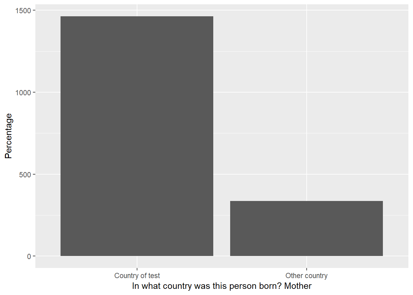
Note: Because the question is randomly sampled, you might be getting a short title. Rerun the script and eventually you’ll get a long one.
So, the question might have two problems. The wording is a bit confusing (something we can’t really do anything about because that’s how it’s written in the questionnaire) and it’s too long. For the second problem I created a function that cuts the title in an arbitrary cutoff point (based on experimental tests on how many letters fit into a ggplot coordinate plane) but it makes sure that the cutoff is not in the middle of a word, i.e. it searches for the closest end of a word.
## Section: Get the title
cut <- 60 # Arbitrary cutoff

# This function accepts a sentence (or better, a title) and cuts it between
# the start and cutoff arguments (just as substr).
# But if the cutoff is not an empty space it will search +-1 index by
# index from the cutoff point until it reaches
# the closest empty space. It will return from start to the new cutoff
sentence_cut <- function(sentence, start, cutoff) {

  if (nchar(sentence) <= cutoff) return(substr(sentence, start, cutoff))

  excerpt <- substr(sentence, start, cutoff)
  actual_val <- cutoff
  neg_val <- pos_val <- actual_val

  if (!substr(excerpt, actual_val, actual_val) == " ") {

    expr <- c(substr(sentence, neg_val, neg_val) == " ", substr(sentence, pos_val, pos_val) == " ")

    while (!any(expr)) {
      neg_val <- neg_val - 1
      pos_val <- pos_val + 1

      expr <- c(substr(sentence, neg_val, neg_val) == " ", substr(sentence, pos_val, pos_val) == " ")
    }

    cutoff <- ifelse(which(expr) == 1, neg_val, pos_val)
    excerpt <- substr(sentence, start, cutoff)
    return(excerpt)

  } else {

    return(excerpt)

  }
}

# How many lines in ggplot2 should this new title have? Based on the cut off
sentence_vecs <- ceiling(nchar(title_question) / cut)

# Create an empty list with the length of `lines` of the title.
# In this list I'll paste the divided question and later paste them together
list_excerpts <- replicate(sentence_vecs, vector("character", 0))
Just to make sure our function works, let’s do some quick tests. Let’s create the sentence This is my new sentence and subset from index 1 to index 17. Index 17 is the letter e from the word sentence, so we should cut the sentence to the closest space, in our case, This is my new.
sentence_cut("This is my new sentence", 1, 17)## [1] "This is my new "A more complicated test using I want my sentence to be cut where no word is still running. Let’s pick from index 19, which is the space between sentence and to, the index 27, which is the u of cut. Because the length to a space -1 and +1 is the same both ways, the function always picks the shortest length as a defensive mechanism to long titles.
sentence_cut("I want my sentence to be cut where no word is still running", 19, 27)## [1] " to be "Now that we have the function ready, we have to automate the process so that the first line is cut, then the second line should start where the first line left off and so on.
for (list_index in seq_along(list_excerpts)) {

  non_empty_list <- Filter(f = function(x) !(is_empty(x)), list_excerpts)

  # If this is the first line, the start should 1, otherwise the sum of all characters
  # of previous lines
  start <- ifelse(list_index == 1, 1, sum(map_dbl(non_empty_list, nchar)))

  # Because start gets updated every iteration, simply cut from start to start + cut
  # The appropriate exceptions are added when its the first line of the plot.
  list_excerpts[[list_index]] <-
    sentence_cut(title_question, start, ifelse(list_index == 1, cut, start + cut))
}

final_title <- paste(list_excerpts, collapse = "\n")
The above loop gives you a list with the title separate into N lines based on the cutoff point. For the ggplot title, we finish by collapsing the separate titles with the \n as the separator.
So, I wrapped all of this into this function:
label_cutter <- function(variable_labels, cut) {

  variable_label <- unname(variable_labels)

  # This function accepts a sentence (or better, a title) and cuts it between
  # the start and cutoff arguments ( just as substr). But if the cutoff is not an empty space
  # it will search +-1 index by index from the cutoff point until it reaches
  # the closest empty space. It will return from start to the new cutoff
  sentence_cut <- function(sentence, start, cutoff) {

    if (nchar(sentence) <= cutoff) return(substr(sentence, start, cutoff))

    excerpt <- substr(sentence, start, cutoff)
    actual_val <- cutoff
    neg_val <- pos_val <- actual_val

    if (!substr(excerpt, actual_val, actual_val) == " ") {

      expr <- c(substr(sentence, neg_val, neg_val) == " ", substr(sentence, pos_val, pos_val) == " ")

      while (!any(expr)) {
        neg_val <- neg_val - 1
        pos_val <- pos_val + 1

        expr <- c(substr(sentence, neg_val, neg_val) == " ", substr(sentence, pos_val, pos_val) == " ")
      }

      cutoff <- ifelse(which(expr) == 1, neg_val, pos_val)
      excerpt <- substr(sentence, start, cutoff)
      return(excerpt)

    } else {

      return(excerpt)

    }
  }

  # How many lines should this new title have? Based on the cut off
  sentence_vecs <- ceiling(nchar(variable_label) / cut)

  # Create an empty list with the amount of lines for the excerpts
  # to be stored.
  list_excerpts <- replicate(sentence_vecs, vector("character", 0))

  for (list_index in seq_along(list_excerpts)) {

    non_empty_list <- Filter(f = function(x) !(is_empty(x)), list_excerpts)

    # If this is the first line, the start should 1, otherwise the sum of all characters
    # of previous lines
    start <- ifelse(list_index == 1, 1, sum(map_dbl(non_empty_list, nchar)))

    # Because start gets updated every iteration, simply cut from start to start + cut
    # The appropriate exceptions are added when its the first line of the plot.
    list_excerpts[[list_index]] <-
      sentence_cut(variable_label, start, ifelse(list_index == 1, cut, start + cut))
  }

  final_title <- paste(list_excerpts, collapse = "\n")
  final_title
}
The function accepts a string and a cut off point. It will automatically create new lines if needed and return the separated title based on the cutoff point. We apply this function over the title and the labels, to make sure everything is clean.
final_title <- label_cutter(title_question, 60)
labels <- map_chr(labels, label_cutter, 35)
Finally, as I’ve outlined above, each question should have less then four labels. I though that it might be a good idea if I created different graphs for different number of labels. For example, for the two label questions, I thought a simple dot plot might be a good idea —— the space between the dots will sum up to one making it quite intuitive. However, for three and four labels, I though of a cutomized dotplot.
At the time I was writing this bot I was learning object oriented programming, so I said to myself, why not create a generic function that generates different plots for different labels? First, I need to assign the data frame the appropriate class.
label_class <-
  c("2" = "labeltwo", '3' = "labelthree", '4' = "labelfour")[as.character(len_labels)]

class(try_df) <- c(class(try_df), label_class)
The generic function, together with its cousin functions, are located in the ggplot_funs.R script in the PISA bot repository linked in the beginning.
The idea is simple. Create a generic function that dispatches based on the class of the object.
pisa_graph <- function(data, y_title, fill_var) UseMethod("pisa_graph")pisa_graph.labeltwo <- function(data, y_title, fill_var) {
dots <- setNames(list(interp(~ fct_reorder2(x, y, z),
x = quote(cnt),
y = as.name(fill_var),
z = quote(Percentage))), "cnt")
# To make sure we can randomly sample a number lower than the length
unique_cnt <- length(unique(data$cnt))
data %>%
filter(cnt %in% sample(unique(cnt), ifelse(unique_cnt >= 15, 15, 10))) %>%
mutate_(.dots = dots) %>%
ggplot(aes(cnt, Percentage)) +
geom_point(aes_string(colour = fill_var)) +
labs(y = y_title, x = NULL) +
scale_colour_discrete(name = NULL) +
guides(colour = guide_legend(nrow = 1)) +
scale_y_continuous(limits = c(0, 100),
breaks = seq(0, 100, 20),
labels = paste0(seq(0, 100, 20), "%")) +
coord_flip() +
theme_minimal() +
theme(legend.position = "top")
}This is the graph for the labeltwo class. Using a work around for non-standard evaluation, I reorder the x axis. This took me some time to understand but it’s very easy once you’ve written two or three expressions. Create a list with the formula (this might be for mutate, filter or whatever tidyverse function) and rename the placeholders in the formula with the appropriate names. Make sure to name that list object with the new variable name you want for this variable. So, for my example, we’re creating a new variable called cnt that will be the same variable reordered by the fill_var and the Percentage variable.
After this, I just built a usual ggplot2 object (although notice that I used mutate_ instead of mutate for the non-standard evaluation).
If you’re interested in learning more about standard and non-standard evaluation, I found these resources very useful (here, here and here)
The generic for labelthree and labelfour are pretty much the same as the previous plot but using a slightly different geom. Have a look at the original file here
We’ll, we’re almost there. After this, we simply, source the ggplot_funs.R script and produce the plot.
source("https://raw.githubusercontent.com/cimentadaj/PISAfacts_twitterBot/master/ggplot_funs.R")
pisa_graph(data = try_df,
             y_title = final_title,
             fill_var = var_name)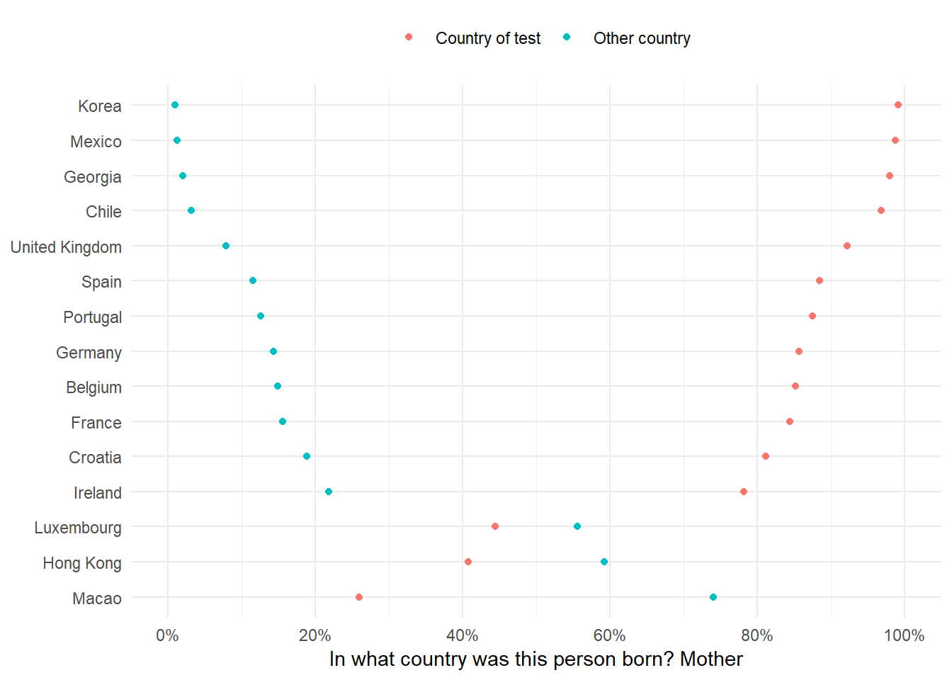
file <- tempfile()
ggsave(file, device = "png")
Setting the twitter bot
The final part is automating the twitter bot. I followed this and this. I won’t go into the specifics because I probably wouldn’t do justice to the the second post, but you have to create your account on Twitter, this will give you some keys that make sure you’re the right person. You need to write these key-value pairs as environment variables (follow the second post) and then delete them from your R script (they’re secret! You shouldn’t keep them on your script but on some folder on your computer). Finally, make sure you identify your twitter account and make your first tweet!
library(twitteR) # devtools::install_github("geoffjentry/twitteR")
setwd("./folder_with_my_credentials/")

api_key             <- Sys.getenv("twitter_api_key")
api_secret          <- Sys.getenv("twitter_api_secret")
access_token        <- Sys.getenv("twitter_access_token")
access_token_secret <- Sys.getenv("twitter_access_token_secret")
setup_twitter_oauth(api_key, api_secret, access_token, access_token_secret)

tweet("", mediaPath = file)
unlink(file)
That’s it! The last line should create thetweet.
Automating the bot
The only thing left to do is automate this to run every day. I’ll explain how I did it for OSx by following this tutorial. You can find a Windows explanation in step 3 here.
First, we need to figure out the specific time we want to schedule the script. We define the time by filling out five stars:
*****
- The first asterisk is for specifying the minute of the run (0-59)
- The second asterisk is for specifying the hour of the run (0-23)
- The third asterisk is for specifying the day of the month for the run (1-31)
- The fourth asterisk is for specifying the month of the run (1-12)
- The fifth asterisk is for specifying the day of the week (where Sunday is equal to 0, up to Saturday is equal to 6)
Taken from here
For example, let’s say we wanted to schedule the script for 3:00 pm every day, then the combination would be 0 15 * * *. If we wanted something every 15 minutes, then 15 * * * * would do it. If we wanted to schedule the script for Mondays and Wednesdays at 15:00 and 17:00 respectively, then we would write 0 15,17 * * 1,3. In this last example the * * are the placeholders for day of the month and month.
In my example, I want the script to run every weekday at 9:30 am, so my equivalent would be 30 9 * * 1-5.
To begin, we type env EDITOR=nano crontab -e in the terminal to initiate the cron file that will run the script. Next, type our time schedule followed by the command that will run the script in R. The command is RScript. However, because your terminal might not know where RScript is we need to type the directory to where RScript is. Type which RScript in the terminal and you shall get something like /usr/local/bin/RScript. Then the expression would be something like 30 9 * * 1-5 /usr/local/bin/RScript path_to_your/script.R. See here for the RScript explanation.
The whole sequence would be like this:
env EDITOR=nano crontab -e
30 9 * * 1-5 /usr/local/bin/RScript path_to_your/script.R
To save the file, press Control + O (to write out the file), then enter to accept the file name, then press Control + X (to exit nano). If all went well, then you should see “crontab: installing new crontab” without anything after that.
Aaaaaand that’s it! You now have a working script that will be run from Monday to Friday at 9:30 am. This script will read the PISA data, pick a random variable, make a graph and tweet it. You can follow this twitter account at [@DailyPISA_Facts](https://twitter.com/DailyPISA_Facts).
Hope this was useful!